
Field sales reps were spending 3–4 hours a week planning client visits, nearly a full working day that could have been spent selling.
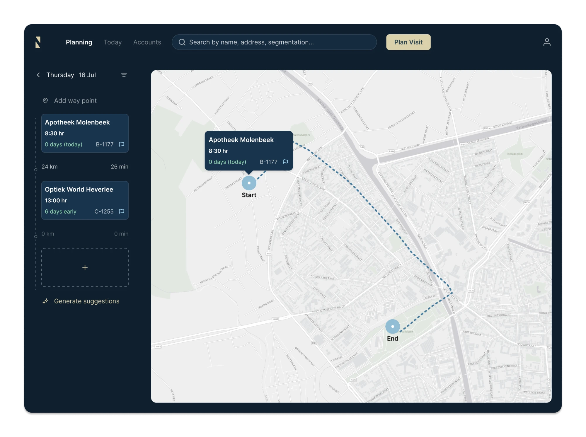
Blindspot uses AI to build optimized weekly routes based on client priority and location. What used to take hours can now be done in around 20 minutes, saving reps roughly 17 working days a year.
I designed the tablet MVP end-to-end in four weeks. The clickable prototype helped Blindspot secure its first paying clients and funding.
We initially assumed reps planned visits months in advance. Research showed they worked week by week.
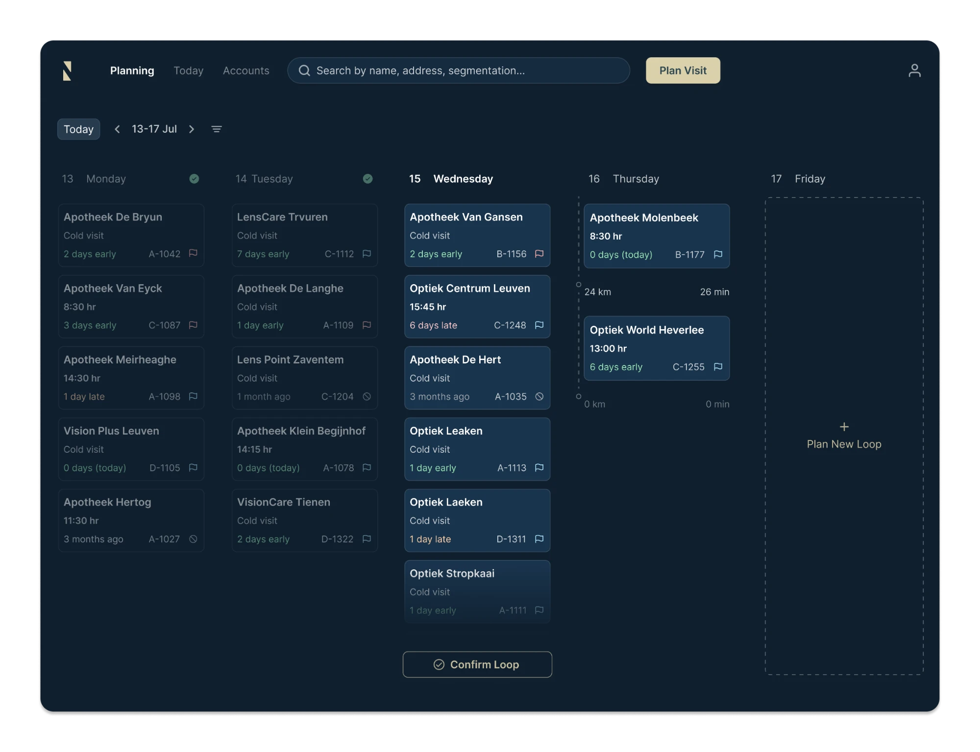
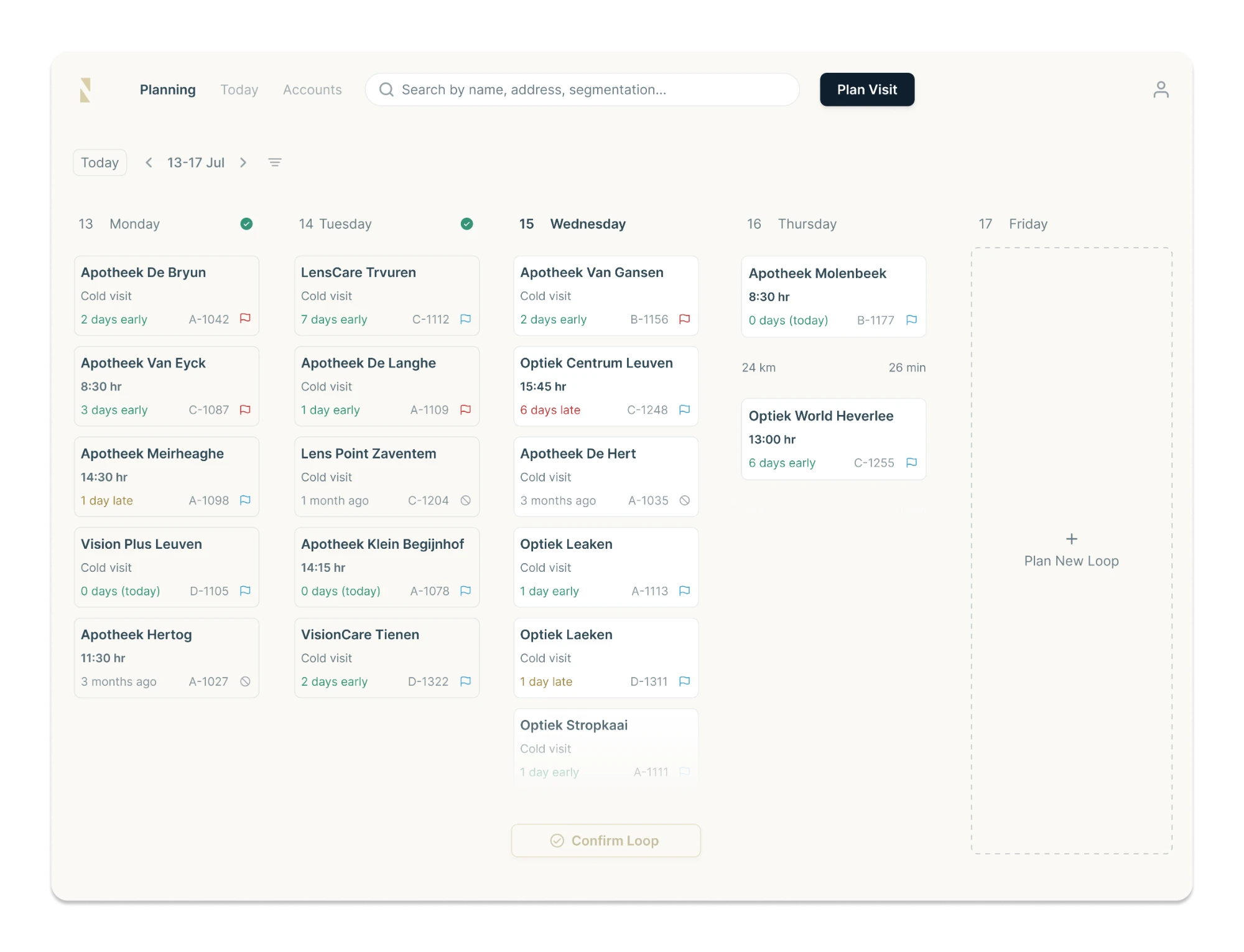
That insight changed the structure of the product. Instead of designing a long-range planning tool, I centered the experience around a weekly view that matched the way reps already organized their work.
Each client card needed to show several pieces of information at once, including priority, visit type, segmentation and timing.
I used hierarchy and color coding to direct attention without making the interface feel crowded. Priority was surfaced through a colored flag, while timing used clear status labels such as "2 days early" or "6 days late."
This made it easier for reps to scan a full week and immediately understand which clients needed attention.
AI could generate an optimized route, but reps still needed the flexibility to make decisions themselves.
They could build part of a route manually and let Blindspot complete the remaining stops. Both interactions used the same visual language, so moving between manual planning and AI assistance felt seamless.
The goal was to make AI feel useful without putting it at the center of the experience. It works quietly in the background, while the rep stays in control.
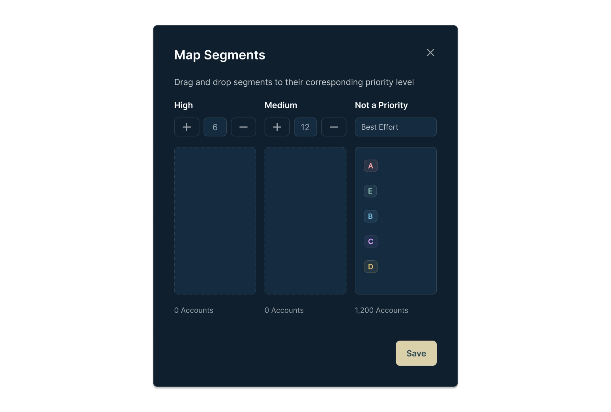
Every company structured its account data differently, with different names for regions, segments, priorities and visit targets.
I designed a mapping step into the import flow that matched CSV columns to Blindspot's fields. Admins could then drag and drop their own segments into three priority tiers and define visit targets.
This allowed companies to bring their existing data into Blindspot without cleaning or restructuring it first, reducing duplicate work and making onboarding much faster.
We moved from a light interface to a dark theme after testing different directions.
The darker visual system better matched Blindspot's brand and gave the product a more professional, premium and powerful feel.